Creating custom Data Studio visualizations with Plotly
 Dariusz Kędzierski
,
Dariusz Kędzierski
,

However its advanced usage is somewhat limited by a small number of advanced visualization options, for example lack of plots with error bars or lack of some popular plot types (box plots!). In this article you'll learn how to write custom visualizations for Data Studio using Plotly library. We will create bar plot with error bars.
Prerequisites
To make this article Ubuntu Linux was used as an operating system, but the toolchain should also work on any modern Windows machine. It is recommended that reader is familiar with JavaScript programming language, but knowledge about any modern programming language should be sufficient to understand this tutorial. To deploy custom visualization you will need Google Cloud account (if you don't have one there is free trial option) with ability to create and read from data buckets.
Installing gsutil
In this tutorial we will be using Google toolchain to write and deploy visualization to Data Studio. For deployment we will need support for Google Cloud and that's why we need to install gsutil. Installing gsutil on ubuntu is really easy. Open terminal and issue command:
$ sudo apt install gsutil Installing node.js
To actually write and run custom visualizations we will need node.js JavaScript library. In Ubuntu Linux one can install this library in two ways.
- You can use a base package from Ubuntu repository. It can be done with:
$ sudo apt install node - Follow nodesource installation instructions for latest builds.
Creating custom visualization
In this paragraph you'll learn how to create, troubleshoot and run custom visualization locally in your browser.
Project template installation
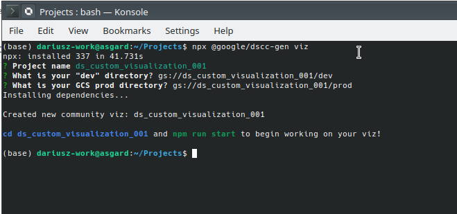
Google prepared a set of scripts that will help us in our work. To set up an template project go to your projects directory and issue command:
$ npx @google/dscc-gen vizYou will be prompted for project name, lets name it ds_custom_visualization_001. Then you will be prompted for bucket name for dev directory in Google Cloud, lets name it gs://ds_custom_visualization_001/dev and bucket name for production directory in Google Cloud, lets name it gs://ds_custom_visualization_001/prod
After a while a project with our custom visualization should be completed.
Now you can change directory to our project
$ cd ds_custom_visualization_001and start visualization from template code.
$ npm run startAnd it failed...
Troubleshooting
Last command can finish with following error message:
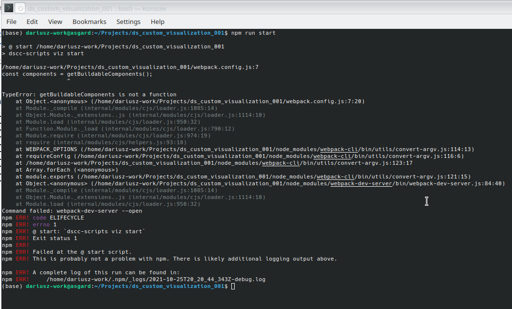
It is known bug described on github. Luckily there is a quite easy solution for this issue, which is described in detail here.
Running visualization from template
After applying fixes from previous chapter start your visualization by issuing command:
$ npm run startYou should see console output similar to shown below
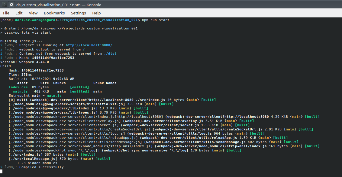
Also new browser window with newly created visualization will be opened

Working with visualization template
In this paragraph you'll learn how to make your own custom visualization by extending template installed in previous paragraph.
Project structure
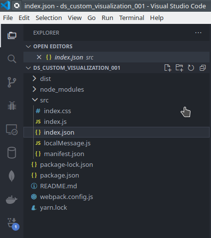
Open project directory with IDE of your choice (Visual Studio Code was used in example). Lets take a brief look in project structure
From our point of view the most important part of the project is the src directory. Inside you will find files that contain all the data required to make new visualization:
index.css- file with style sheets for our visualization,index.js- main file with sources of our visualization,index.json- file with dimensions and metrics definitions for our plot, also definitions of config fields for our plotmainfest.json- file with project description,-
localMessage.js- dummy data used to test visualization locally.
Preparing data
Before we start our work on visualization we need to understand the data format used by Data Studio. Generally Data Studio sends data in JSON format to visualization component, to know what is what we need to take a deeper look into index.json and localMessage.js files. For better understanding of this two files lets create a Data Studio report and add some data source to it. For convenience you can use an already prepared csv file with some data describing retention on some milestones for two different experiments. File can be downloaded using this link.
So lets get started:
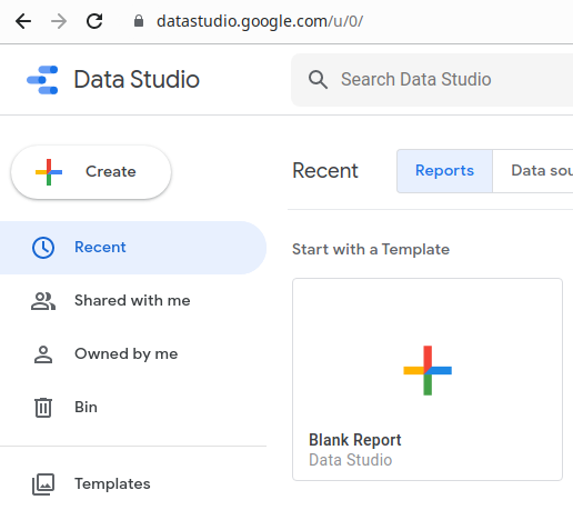
- Open your browser and navigate to Google Data Studio home page, it can be found here.
- Create new empty report by clicking
+icon with described as empty report.
- You will be prompted for adding new data source, lets upload
csvfile as our data source.
- You should end up with screen simmilar to this
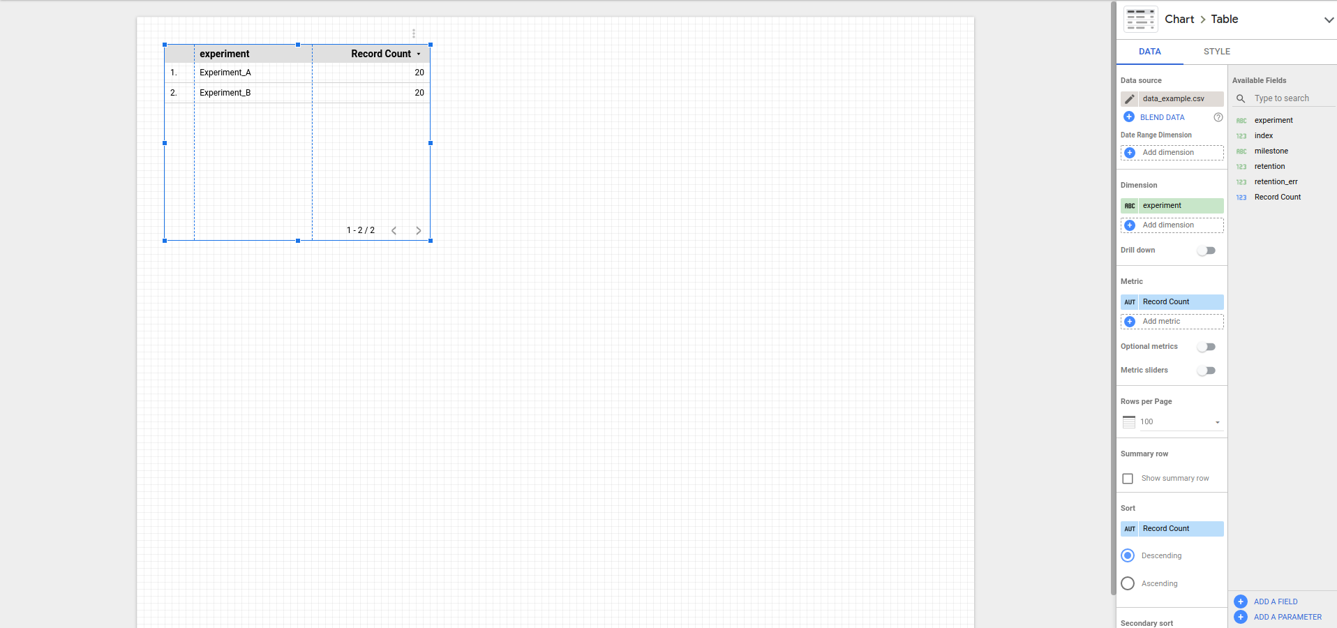
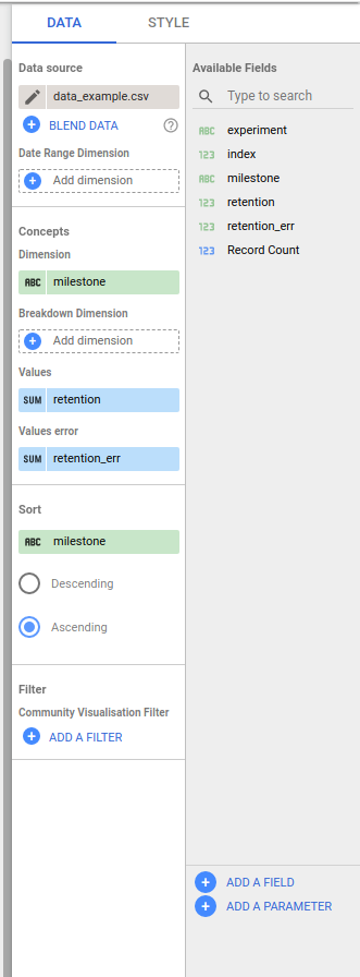
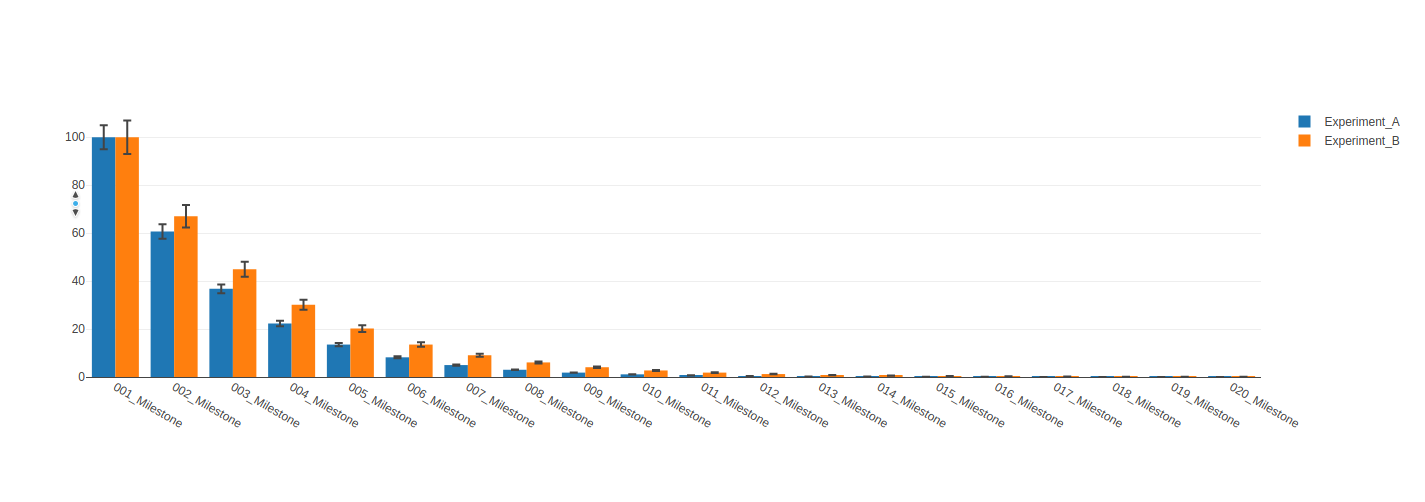
To understand the role of index.json lets add a plot to our report. In this example we will add simple line plot, after some tweaking it look like that.
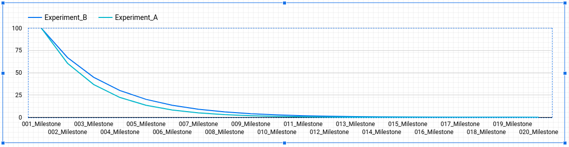
In this plot we set milestone column as a dimension, experiment column as a breakdown dimension and retention as a metric.
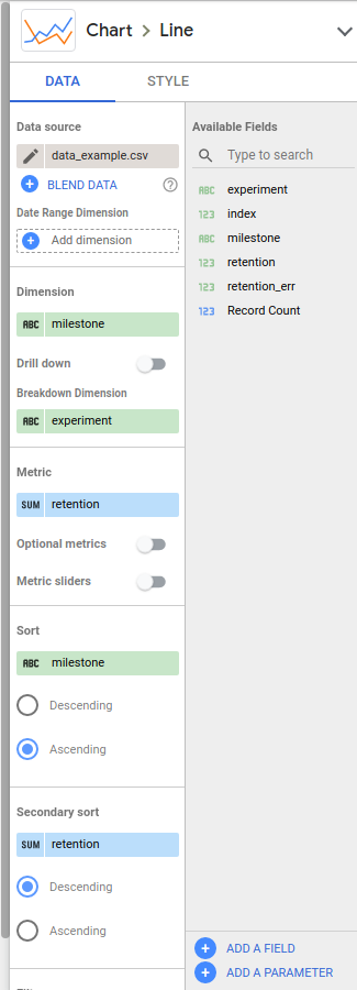
File index.json allows the programmer to define the interface of the plot. In this file we can define how many dimensions and metrics can be used by the plot. Also we can use it to define breakdown dimensions or allow user to change the appearance of the plot by allowing to change styles.
Currently in our project we have very minimalistic index.json file with only one dimension and one metric defined. Additionally our localMessage.js file contains some dummy data which not necessarily represent the data we want to plot. Looking at the data in csv file we probably would like to use milestone column as a dimension, experiment column as a breakdown dimension and retention as a metric but also retention_err column as error values for retention column. We have to make changes to index.json.
{
  "data": [
    {
      "id": "concepts",
      "label": "Concepts",
      "elements": [
        {
          "id": "indexDimension",
          "label": "Dimension",
          "type": "DIMENSION",
          "options": {
            "min": 1,
            "max": 1
          }
        },
        {
          "id": "breakdownDimension",
          "label": "Breakdown Dimension",
          "type": "DIMENSION",
          "options": {
            "min": 0,
            "max": 1
          }
        },
        {
          "id": "values",
          "label": "Values",
          "type": "METRIC",
          "options": {
            "min": 1,
            "max": 1
          }
        },
        {
          "id": "valuesError",
          "label": "Values error",
          "type": "METRIC",
          "options": {
            "min": 1,
            "max": 1
          }
        }
      ]
    }
  ],
  "style": []
}
Now it is time to generate localMessage.js file based on our data. To do that we will add our visualization to Google Data Studio and it will generate message file for us.
Adding custom visualization to Data Studio
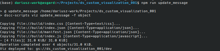
First we need to ensure that our project is using new index.json. To do that we need to run update_message command from project directory. Open terminal and change directory to your project directory, next issue command
$ npm run update_messageThe project will be updated and project files will be copied to dev directory in your Google Cloud bucket.
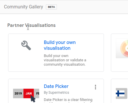
Now our visualization is ready to be added to Data Studio. Click Community visualizations and components icon then click Explore more
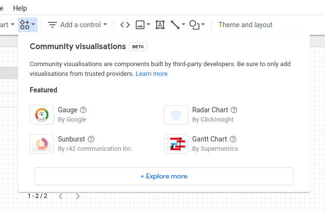
and Build your own visualization
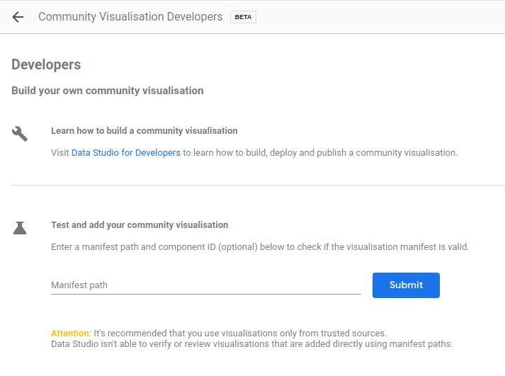
in Test and add your community visualisation add a path to your visualization, path can be found at the end of update_message command output, then hit Submit button.
You should be able to add widget with your visualization to current Data Studio report, but instead of plot you should see some text output. That text is actual JSON with our data.
Take a look at the panel on your right, you should see the effect of updating index.json now we will have some new fields - just as we defined them. Add proper columns to dimension, breakdown dimension, values and values error fields and observe changes in widget. Next copy text from widget and paste it to localMessage.js
Installing Plotly
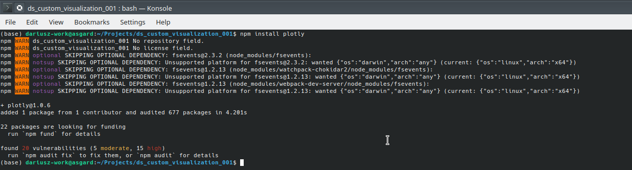
Installing Plotly is very simple. Just open your terminal and change directory to your project directory, then issue command
$ npm install plotlyPlotly library will be installed to your project and you should see output similar to this shown on screenshot below.
Using plotly library in our project
To actually use Plotly for plotting our data we need to import this library to our source code. Open index.js you should see listing as below
const dscc = require('@google/dscc');
const viz = require('@google/dscc-scripts/viz/initialViz.js');
const local = require('./localMessage.js');

// write viz code here
const drawViz = (data) => {
  viz.readmeViz();
  viz.firstViz(data);
};

// renders locally
if (DSCC_IS_LOCAL) {
  drawViz(local.message);
} else {
  dscc.subscribeToData(drawViz, {transform: dscc.objectTransform});
}
So far there is not much to see here, we have only some template code. We will remove template code, and make changes in function names.
// import plotly to our project
const plotly = require('plotly.js-dist')
const dscc = require('@google/dscc');
const local = require('./localMessage.js');

// ensure that we are working in local development mode
// using localMessage.js as a data source for our plot
const DSCC_IS_LOCAL = true;

// here we will add our plotting routine
const drawBarPlotWithErrorBars = (data) => {
};

// renders locally
if (DSCC_IS_LOCAL) {
  drawBarPlotWithErrorBars(local.message);
} else {
  dscc.subscribeToData(drawBarPlotWithErrorBars, {transform: dscc.objectTransform});
}
According to the documentation Plotly plot function requires div element to attach a new plot. Lets add a function which will create new div element for us, also we will add a code to create container in drawBarPlotWithErrorBars function body.
// import plotly to our project
const plotly = require('plotly.js-dist')
const dscc = require('@google/dscc');
const local = require('./localMessage.js');

// ensure that we are working in local development mode
// using localMessage.js as a data source for our plot
const DSCC_IS_LOCAL = true;

// create div element with id `containerId` if div with given id exists is present
// in DOM it will be destroyed and new one will be created
const makeNewContainer = (containerId) => {
    if (document.querySelector('div')) {
        var oldDiv = document.getElementById(containerId);
        oldDiv.parentNode.removeChild(document.getElementById(containerId));
    }
    var divElement = document.createElement('div');
    divElement.id = containerId;
    document.body.appendChild(divElement);
    return divElement;
};

// here we will add our plotting routine
const drawBarPlotWithErrorBars = (data) => {
  // create new container for our plot
  var container = makeNewContainer('visualization')
};

// renders locally
if (DSCC_IS_LOCAL) {
  drawBarPlotWithErrorBars(local.message);
} else {
  dscc.subscribeToData(drawBarPlotWithErrorBars, {transform: dscc.objectTransform});
}
Now we are ready to add some data and make some plotting.
Porting Data Studio data format to Plotly format
The problem is that the data format of the input data for plotly.newPlot function differs from data supplied by Google Data Studio. Lets compare those data formats.
According to documentation plotly.newPlot expects array of dictionaries as a input data. Each dictionary represents one trace a.k.a series. In our case we want to make bar plot with y error bars, plotly.newPlot expect data in format described in code below.
// Plotly data format
var data = [
   {
      name: 'series 1 name',
      x: [],
      y: [],
      error_y: {
         type: 'data',
         array: [],
         visible: true
      },
      type: 'bar'
   }
]
Under key name we have name of data series, this name will be shown in plot legend. Keys x and y holds arrays of data to plot for x and y axis. Key error_y holds error bar data. Key type describes the type of the plot. Each plot type can have its own specific keys, for more information about available keys check documentation.
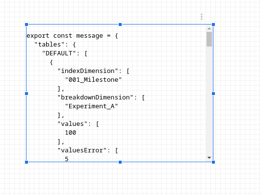
Google Data Studio format has a form of dictionary, one of the keys named tables holds table data under key DEFAULT where we can find an array of dictionaries with keys named like fields defined in index.json.
//Google Data Studio data format.
export const message = {
  "tables": {
    "DEFAULT": [
      {
        "indexDimension": [
          "001_Milestone"
        ],
        "breakdownDimension": [
          "Experiment_A"
        ],
        "values": [
          100
        ],
        "valuesError": [
          5
        ]
      },
      {
        "indexDimension": [
          "001_Milestone"
        ],
        "breakdownDimension": [
          "Experiment_B"
        ],
        "values": [
          100
        ],
        "valuesError": [
          7
        ]
      },
      ...
    ]
  }
}
To translate the Google Data Studio format to Plotly format we have to move data from indexDimension to x array, data from values to y array and data from valuesError to error_y under key array. Additionally we will use breakdownDimension as series name. Lets write a code that perform this operation:
// data from Google Data Studio
var rowData = data.tables.DEFAULT;

// data processed by our algorithm.
var processedData = {};

// for each data row in Google Data Studio data
rowData.forEach(function (row) {
    // it there is a `breakdownDimension` present in our data we need to store separate series for each `breakdownDimension`
    if (row['breakdownDimension']) {
        // if given key does not exist in processedData dict we will create one and initialze it with empty data structure
        // thet is "plotly friendly"
        if (!processedData[row['breakdownDimension']]) {
            processedData[row['breakdownDimension']] = {
                name: row['breakdownDimension'][0],
                x: [],
                y: [],
                error_y: {
                    type: 'data',
                    array: [],
                    visible: true
                },
                type: 'bar'
            };
        }
        processedData[row['breakdownDimension']]['x'].push(row['indexDimension'][0]);
        processedData[row['breakdownDimension']]['y'].push(row['values'][0]);
        processedData[row['breakdownDimension']]['error_y']['array'].push(row['valuesError'][0]);
    }
    // when we don't have data splitted by `breakdownDimension` we will use a field name as a series name
    // field names can be exracted from Google Data Studio data
    else {
        if (!processedData[data.fields.values[0].name]) {
            processedData[data.fields.values[0].name] = {
                name: data.fields.values[0].name,
                x: [],
                y: [],
                error_y: {
                    type: 'data',
                    array: [],
                    visible: true
                },
                type: 'bar'
            };
        }
        processedData[data.fields.values[0].name]['x'].push(row['indexDimension'][0]);
        processedData[data.fields.values[0].name]['y'].push(row['values'][0]);
        processedData[data.fields.values[0].name]['error_y']['array'].push(row['valuesError'][0]);
    }
}
);

// plotly accepts data as a list of dictionaries so we need to transform dictionary to a list of values
var data1 = Object.values(processedData);
Putting it all together
Now we have all elements required to make our Plotly visualization. It is time to assemble the whole script.
// import plotly to our project
const plotly = require('plotly.js-dist')
const dscc = require('@google/dscc');
const local = require('./localMessage.js');

// ensure that we are working in local development mode
// using localMessage.js as a data source for our plot
const DSCC_IS_LOCAL = true;

// create div element with id `containerId` if div with given id exists is present
// in DOM it will be destroyed and new one will be created
const makeNewContainer = (containerId) => {
    if (document.querySelector('div')) {
        var oldDiv = document.getElementById(containerId);
        oldDiv.parentNode.removeChild(document.getElementById(containerId));
    }
    var divElement = document.createElement('div');
    divElement.id = containerId;
    document.body.appendChild(divElement);
    return divElement;
};

// here we will add our plotting routine
const drawBarPlotWithErrorBars = (data) => {
  // create new container for our plot
  var container = makeNewContainer('visualization')

  // data from Google Data Studio
  var rowData = data.tables.DEFAULT;

  // data processed by our algorithm.
  var processedData = {};

  // for each data row in Google Data Studio data
  rowData.forEach(function (row) {
      // it there is a `breakdownDimension` present in our data we need to store separate series for each `breakdownDimension`
      if (row['breakdownDimension']) {
          // if given key does not exist in processedData dict we will create one and initialze it with empty data structure
          // that is "Plotly friendly"
          if (!processedData[row['breakdownDimension']]) {
              processedData[row['breakdownDimension']] = {
                  name: row['breakdownDimension'][0],
                  x: [],
                  y: [],
                  error_y: {
                      type: 'data',
                      array: [],
                      visible: true
                  },
                  type: 'bar'
              };
          }
          processedData[row['breakdownDimension']]['x'].push(row['indexDimension'][0]);
          processedData[row['breakdownDimension']]['y'].push(row['values'][0]);
          processedData[row['breakdownDimension']]['error_y']['array'].push(row['valuesError'][0]);
      }
      // when we don't have data splitted by `breakdownDimension` we will use a field name as a series name
      // field names can be exracted from Google Data Studio data
      else {
          if (!processedData[data.fields.values[0].name]) {
              processedData[data.fields.values[0].name] = {
                  name: data.fields.values[0].name,
                  x: [],
                  y: [],
                  error_y: {
                      type: 'data',
                      array: [],
                      visible: true
                  },
                  type: 'bar'
              };
          }
          processedData[data.fields.values[0].name]['x'].push(row['indexDimension'][0]);
          processedData[data.fields.values[0].name]['y'].push(row['values'][0]);
          processedData[data.fields.values[0].name]['error_y']['array'].push(row['valuesError'][0]);
      }
  }
  );

  // plotly accepts data as a list of dictionaries so we need to transform dictionary to a list of values
  var data1 = Object.values(processedData);

  var layout = { barmode: 'group' };
  plotly.newPlot(container, data1, layout);
};

// renders locally
if (DSCC_IS_LOCAL) {
  drawBarPlotWithErrorBars(local.message);
} else {
  dscc.subscribeToData(drawBarPlotWithErrorBars, {transform: dscc.objectTransform});
};
You can copy this script and paste it to index.js file. Now it is time to check if our script is working as expected.
Plotting our data
Open console and change directory to project directory. Run command:
$ npm run startNew browser tab will be opened and, if project compiled without any issues, you should see our new and custom visualization based on Plotly.
Now we can deploy it on production bucket in Google Cloud.
Deploying on Google Cloud
First we need to disable local development mode in our index.js. To do that just replace
const DSCC_IS_LOCAL = true;with
const DSCC_IS_LOCAL = false;Now we will deploy our finished visualization to dev bucket. Open console and change directory to your project directory. Build dev version of the visualization with command
npm run build:dev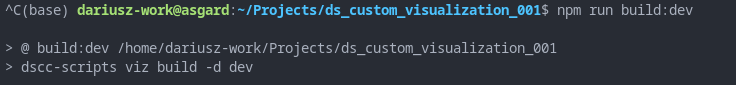
and now push it to dev bucket with command
npm run push:dev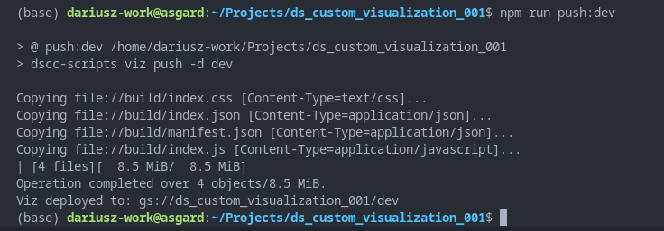
To test if everything is working properly add your visualization do Data Studio report and assign data to the plot - just like we did when we wanted to download data for localMessage.js. You will notice that instead of text the widget will show a plot.
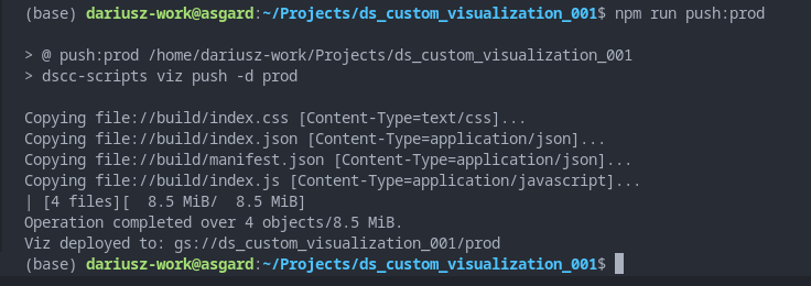
Now you can build production version and push it to production bucket
npm run build:prod
and
npm run push:prod